
As you probably know by now the Data Warehouse is a Business Intelligence data storage system, it is GUI or viewer agnostic, viewers of users choice are welcome. MS Excel is the most popular one, but more and more users prefer Qlikview apps.
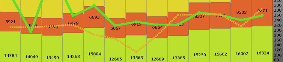
This monthly twitter graph is an attempt by me to show usage of the Data Warehouse and most usage is covered is the mQuery (millions of SQL queries, the lime-green line), But you do not see the Qlikview user activities, since Qlikview has it’s own proprietary storage. Data Warehouse information is exported to Qlikview,from there you have to measure activities via Qlikview. This is maybe thebiggest drawback of Qlikview, it is a closed environment, once the data is imported to Qlikview you can only access the data via Qlikview. You should not import the data directly from source systems into Qlikview, but use an open storage in between if you like to use other viewers together with Qlikview.
I have used the calls figures from the Qlikview session logs, to illustrate user activities. The dotted dark yellow line represents Qlikview calls in the tens of thousands. If this is good figure to show Qlikview user activities I really do not know, if you have opinions on this please tell me.
You follow the Data Warehouse tweets here.
No comments:
Post a Comment